Green Up Vermont
Website Redesign & Case Study
Project
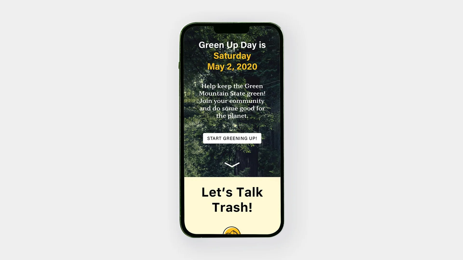
This project was researching, designing, prototyping, and testing a redesign of a website. The goal was to update the visual design, information architecture, and overall usability for a target audience, provide clear information, promote the purpose of the organization, and highlight ways to engage with its services.
Client
Green Up Day, always the first Saturday in May, was launched in 1970. It was created to clean up Vermont’s roads and combat littering. In 1979, the nonprofit organization Vermont Green Up Inc. was formed to carry on the tradition of Green Up Day. It is an annual statewide event, when over 22,000 volunteers come together to remove litter from Vermont’s roadsides and public spaces.
Task
The site for Green Up Vermont needs to be redesigned to clarify important information, organize the content, and create a visual language and brand. There needs to be an increase in awareness of the organization, the day, and the resources available. It currently does not serve those purposes in the best way possible.
Solution
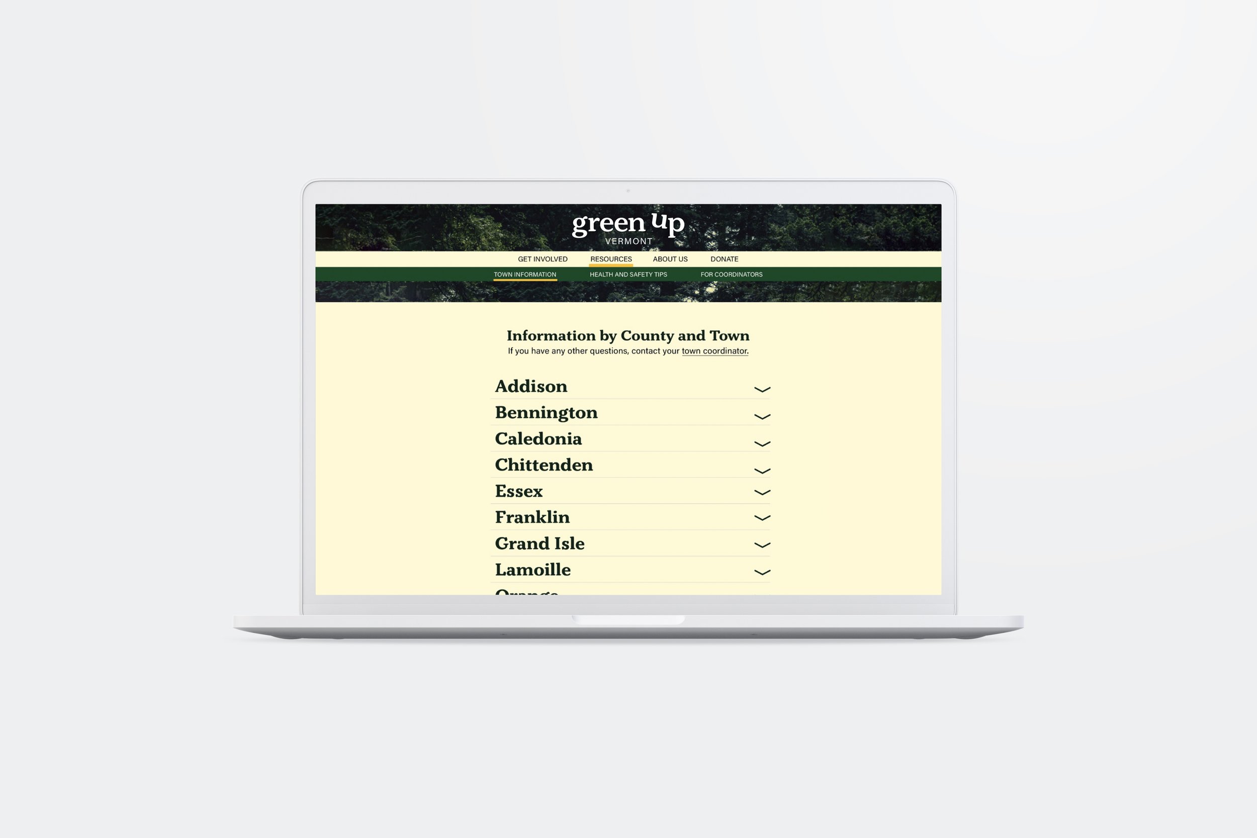
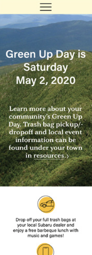
The redesign of GreenUpVermont.org will reorganize and improve the site to address the needs of the business, brand and users. The important information will be more prominent on the homepage to increase the participation and awareness of users. The navigation will be organized to find resources and information easier. The brand will be redesigned to feel more accessible and fun. The donation page will be kept internal for easier donating to fund program outreach and new initiatives.
before


Goals
Business
Increase participation
Increase awareness
Increase donations
Take on more projects
Brand
Refine the look and message
Appeal to all Vermonters
Increase app & social media usage
User
Easily find information
Use the resources
Learn more about the organization
Support / Donate
information architecture
Before
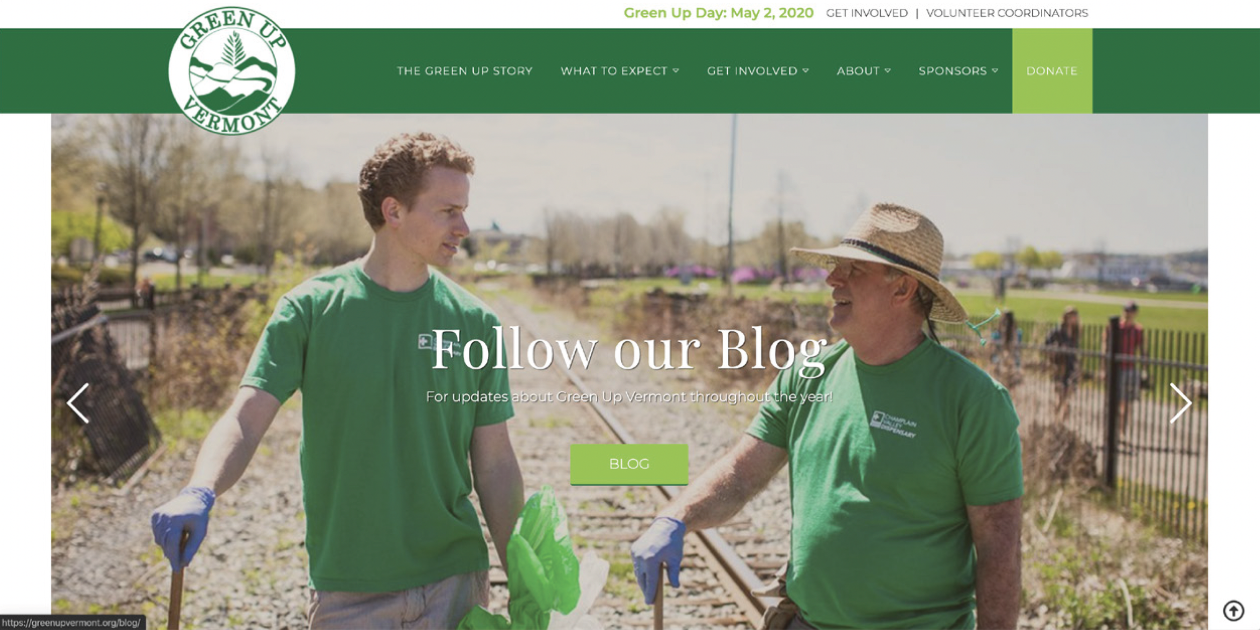
The content and structure of the website is disjointed. Important pages and information aren’t easily accessible. The design and navigation don’t give emphasis or hierarchy to content. The donate page also links to a third party which might decrease legitimacy and trust. All of these issues make the site ineffective.
After
I reorganized and simplified the navigation into easy to understand categories that were intuitive and commonplace on a nonprofit’s website. Information is nested under appropriate pages. Important content is easy to find.
Brand identity
Assets
This minimal rebrand was to set a foundation for the new website. The colors, type, and other assets are to represent the goals of the organization and feel just as Vermont-y as the concept of Green Up Day. Earthy, fun, and responsible.
imagery
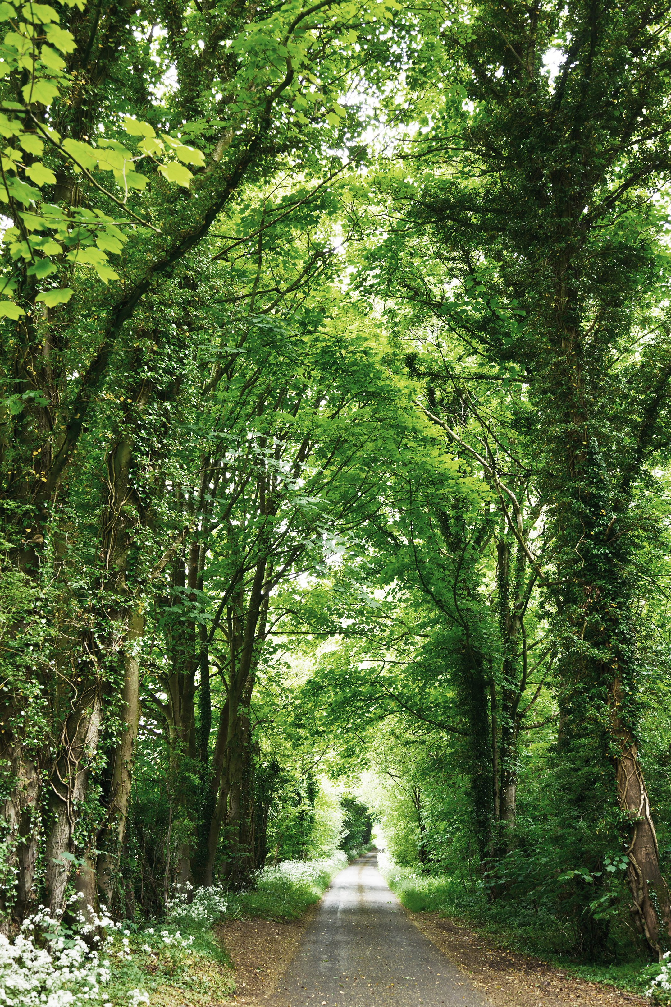
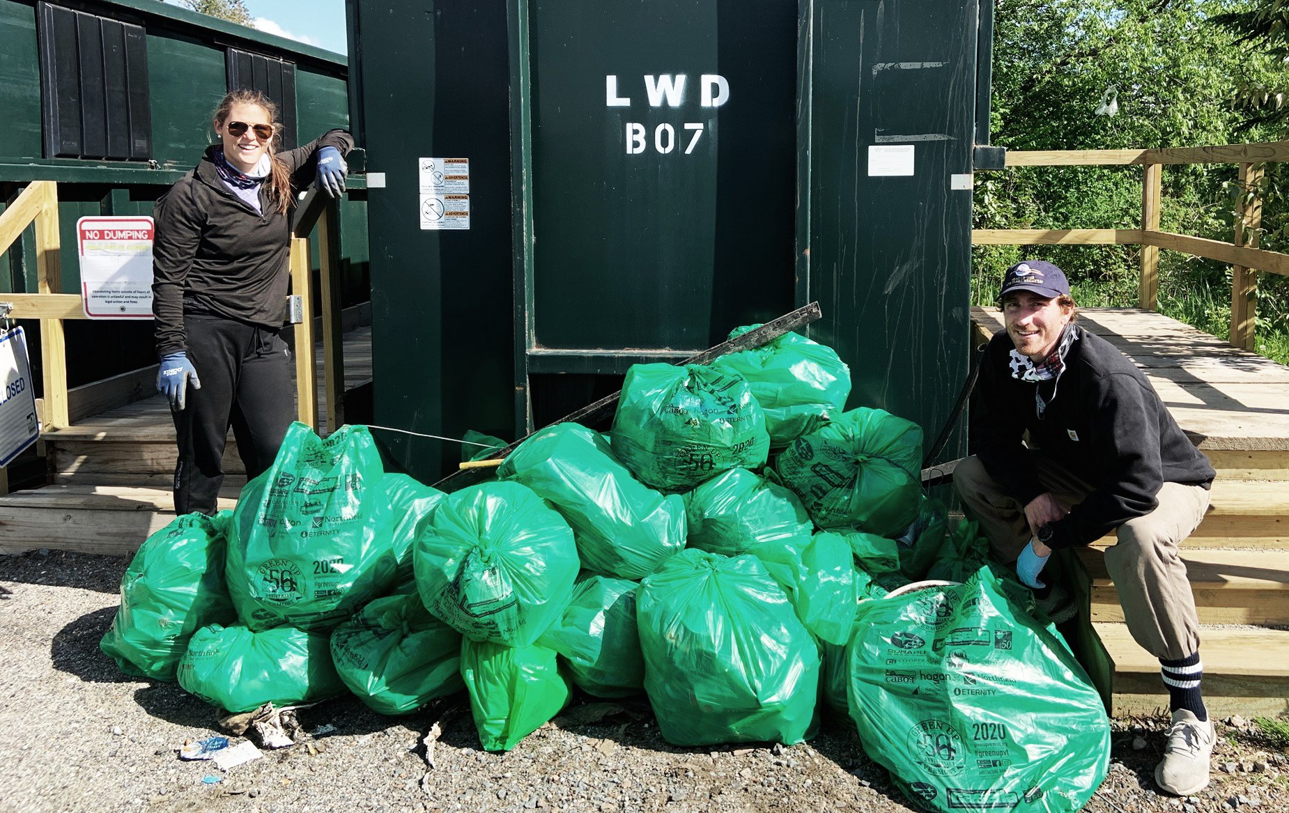
Pictures should be a primary touchpoint for the brand and should showcase the wonderful scenery and generosity of Vermont.
Exploration & iteration
Wireframes
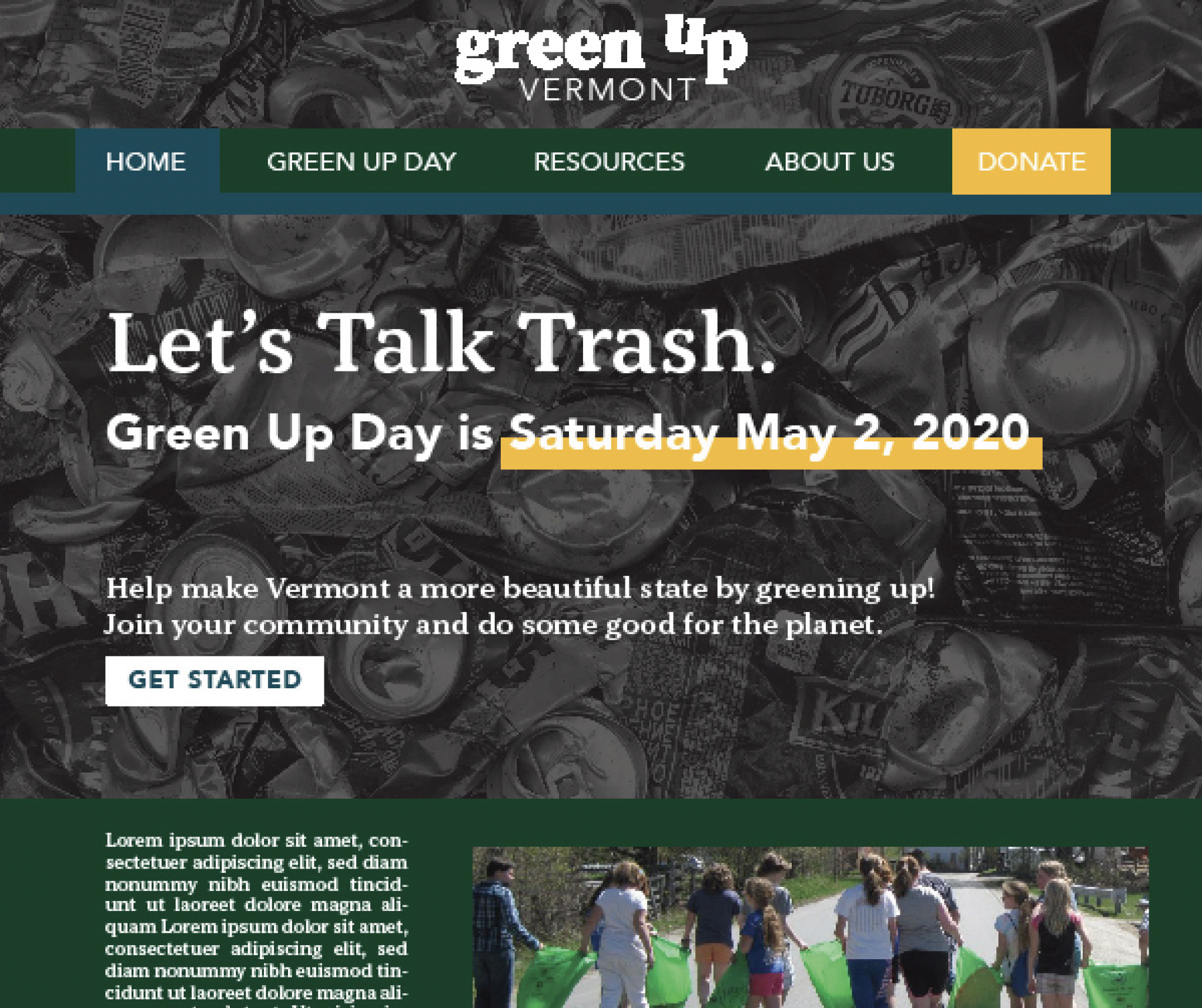
Beginning with conceptual wireframes, I wanted the design to be reliable and easy to navigate while also engaging and as fun as Green Up Day itself.
After a round of full color designs I got feedback and moved forward with the design that accomplished the most goals and got the best engagement.
